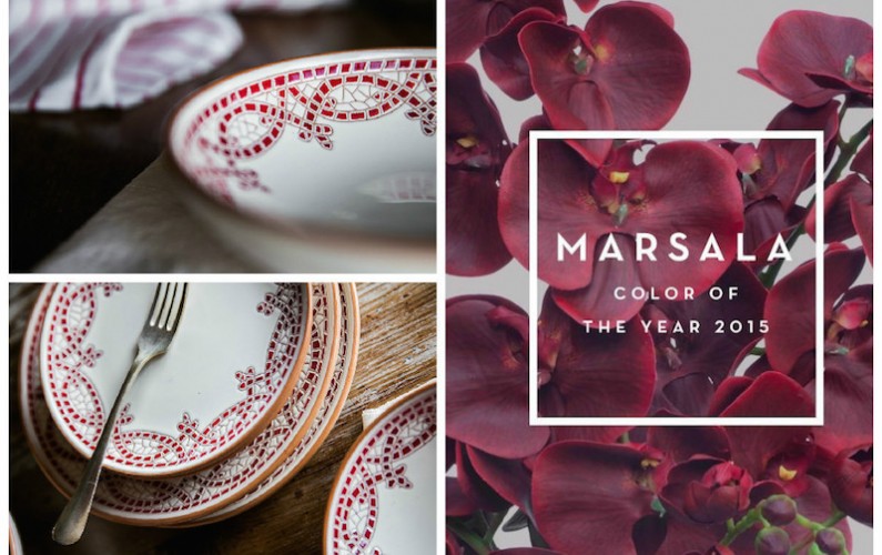
Everybody knows Marsala has been selected as Pantone Color of the Year 2015. The choice of this color is motivated by Leitrice Eiseman, Executive Director of the Pantone Color Institute as following: “Marsala enriches our mind, body and soul, exuding confidence and stability. It is a subtly seductive shade that draws us into its embracing warmth”.
Let’s discover together this beautiful color and some tips in order to create the perfect match with your tableware!
Marsala is a red vinous color that can be declined in many nuances: bordeaux, burgundy, grenade, pomegranate. It has an intense range of attributes that all together determine a strong personality: full-bodied, vibrant, velvety, warm, elegant.
Marsala adds a “natural soul” to Pantone color chips by creating a synesthesia, a strong sensorial contamination: the color takes its name from real objects, from food and in this case from a Sicilian local vine. It inspires a sensorial mix that involves at the same time sight and taste, boosting the communicative power of the color.
We can easily say that Marsala is a stylish as well as tasty color. And in the year of the Milan Expo that celebrates food and wine we wonder if that can be just a coincidence!
Versatility is another strong quality of this color. Thanks to its earthy yet stylish tones, Marsala has an impressive allure and it can be easily used in beauty, home interiors, design, furnishing and fashion. Appealing both to women and men, it perfectly matches for accessories and apparels. Marsala is a great “ready to use” color for beauty, giving a special highlight for cheeks and a captivating pop of color for lips, nail and hair.
Marsala also brings warmth into home interiors. From Byzantine Mosaics to the 90’s, when it was used a lot as wall plaster to create a Tuscan look, Marsala is a timeless color and its earthy nuances have always encouraged creativity and experimentation.
How to combine Marsala color in your table setting.
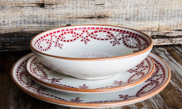
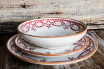
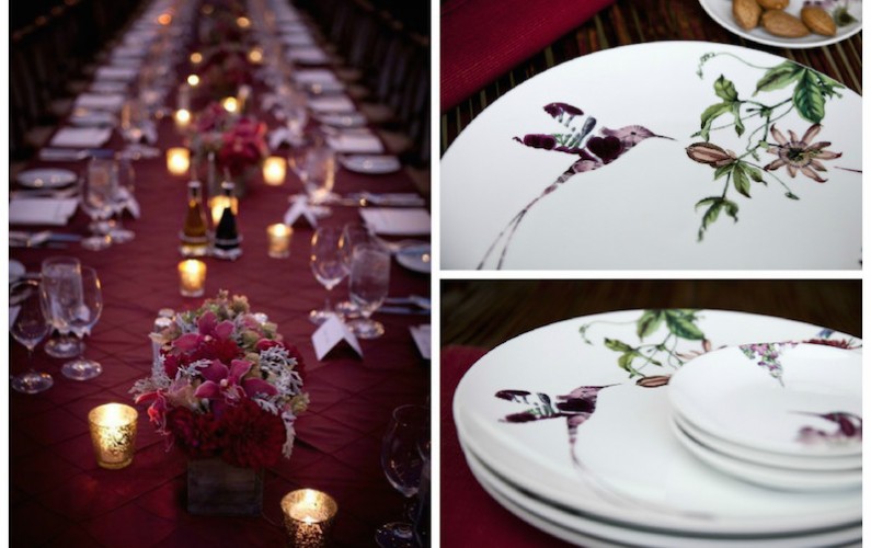
Let’s give you some useful tips on how to combine Marsala for different moods. For the tabletop it works with anything! Look at our Colibrì collection for a dreamy table setting…
For an intense and sensual atmosphere we suggest to use Marsala with black or dark green. For accents of indulgence and luxury use it with gold. To warm up a cold palette, pair Marsala with grey.
In other words be brave, don’t hesitate to mix it with other colors, especially with neutral (beige, ivory), green even with blue; but remember to use it in small doses, as a precious “jewel color”, or better, as with the famous Marsala wine, that should be drunk in small sips, tasting the flavors without getting drunk. Cheers!
We at DishesOnly have selected the best tableware matches for a Marsala themed soirée… enjoy it!
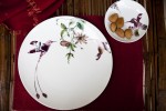
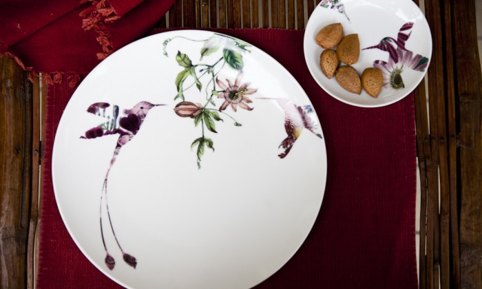 Colibrì | Bird Porcelain Dinner Set More Details