On our Dishesonly social media accounts we have decided to post table styling ideas that featured the 2020 Pantone colors with our marvelous collection. If you want to set up your table with the trendiest colors of the year, keep reading!
Each year Pantone chooses the color of the year, dictating the new color trends in fashion and design. The Pantone color of 2020 is Classic Blue: calm, confidence and connection. Besides the color of the year, Pantone has published the Fashion Color Trend Report, which illustrates the most popular color trends of Spring/Summer 2020 in fashion and decor. The palette is formed by 12 shades, plus 4 neutrals.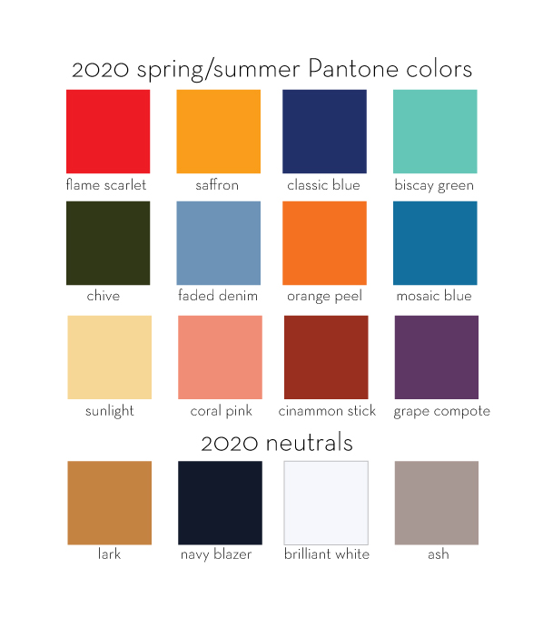
Now, let’s discover our 5 choices of table styling ideas with different combinations of the 2020 Pantone colors!
1. Lightness and elegance
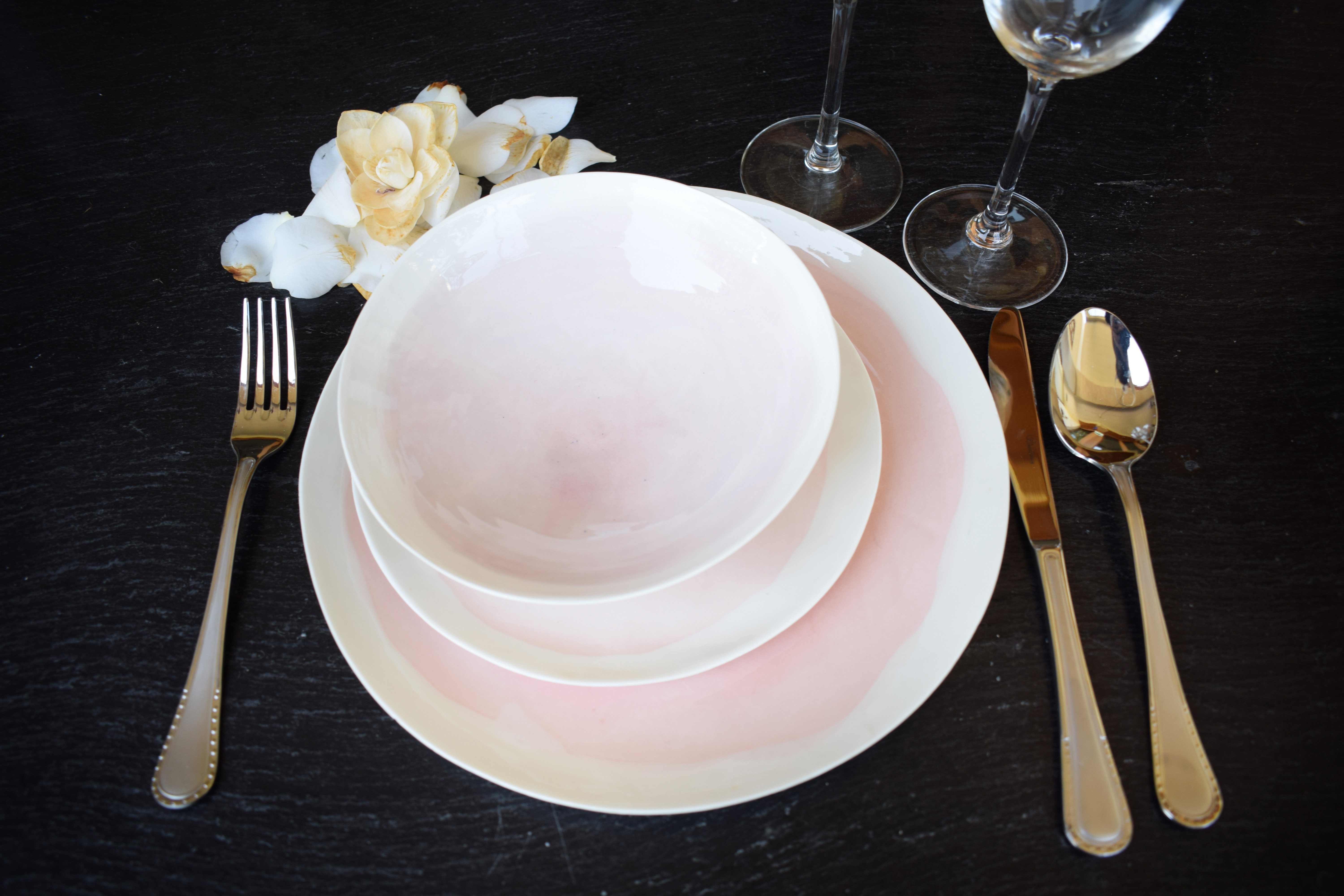
This is a simple table setting idea that combines the delicate colors of Coral Pink (our Acquerello) and Sunlight (the yellow petals) with a strong darker Navy blazer background surface. The effect is an elegant dinner table with a delicate touch. Therefore, we recommend it for Spring dinners with a Classic vibe.
2. Vibrant colors
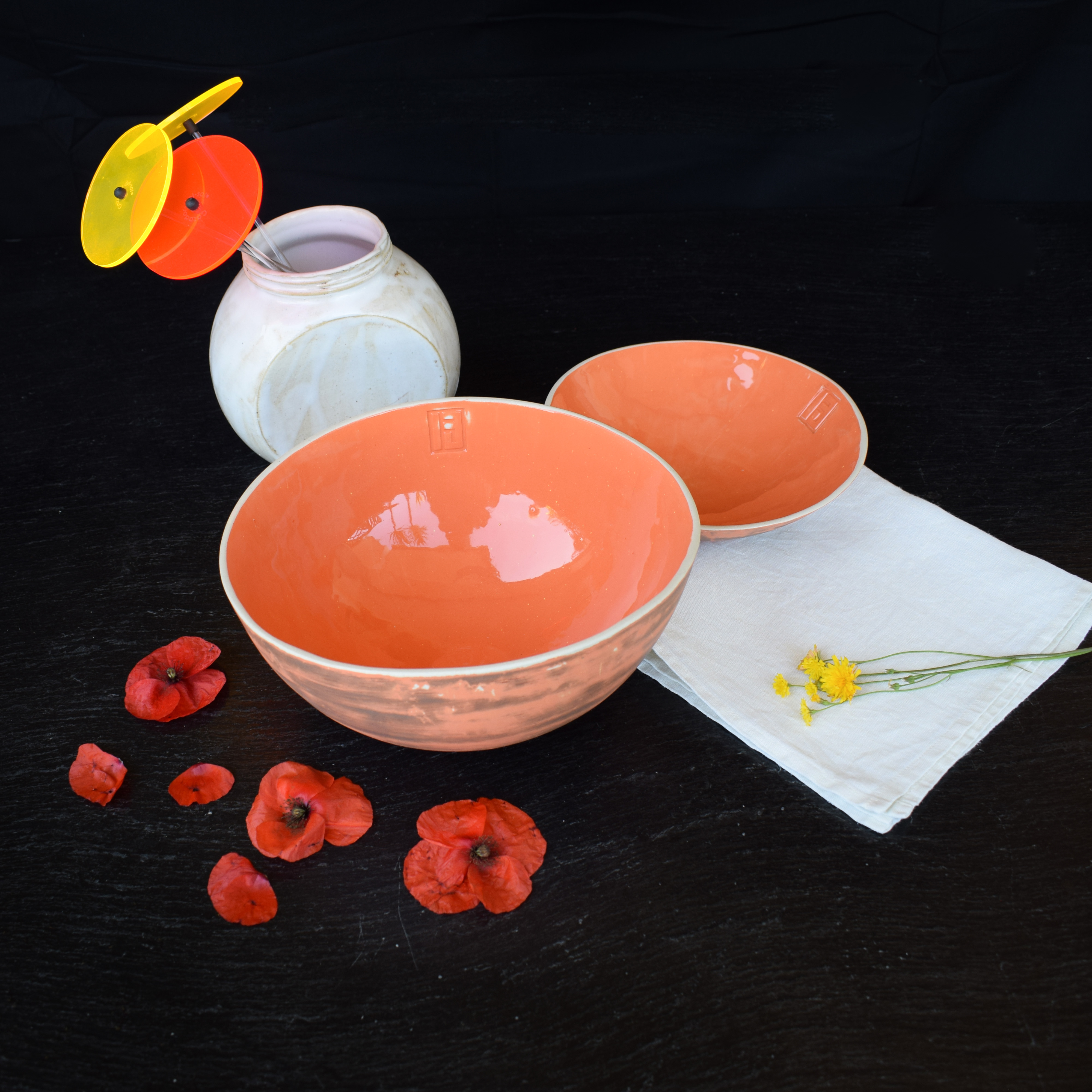

This table setting is perfect for both Spring or Summer settings. The vibrant tones are given by our orange Tribù bowl, by the red poppies, the yellow flowers and the red and yellow decoration. The strong Navy Blazer background blends the colors together, while the Brilliant White napkin softens the color palette.
3. Green regeneration
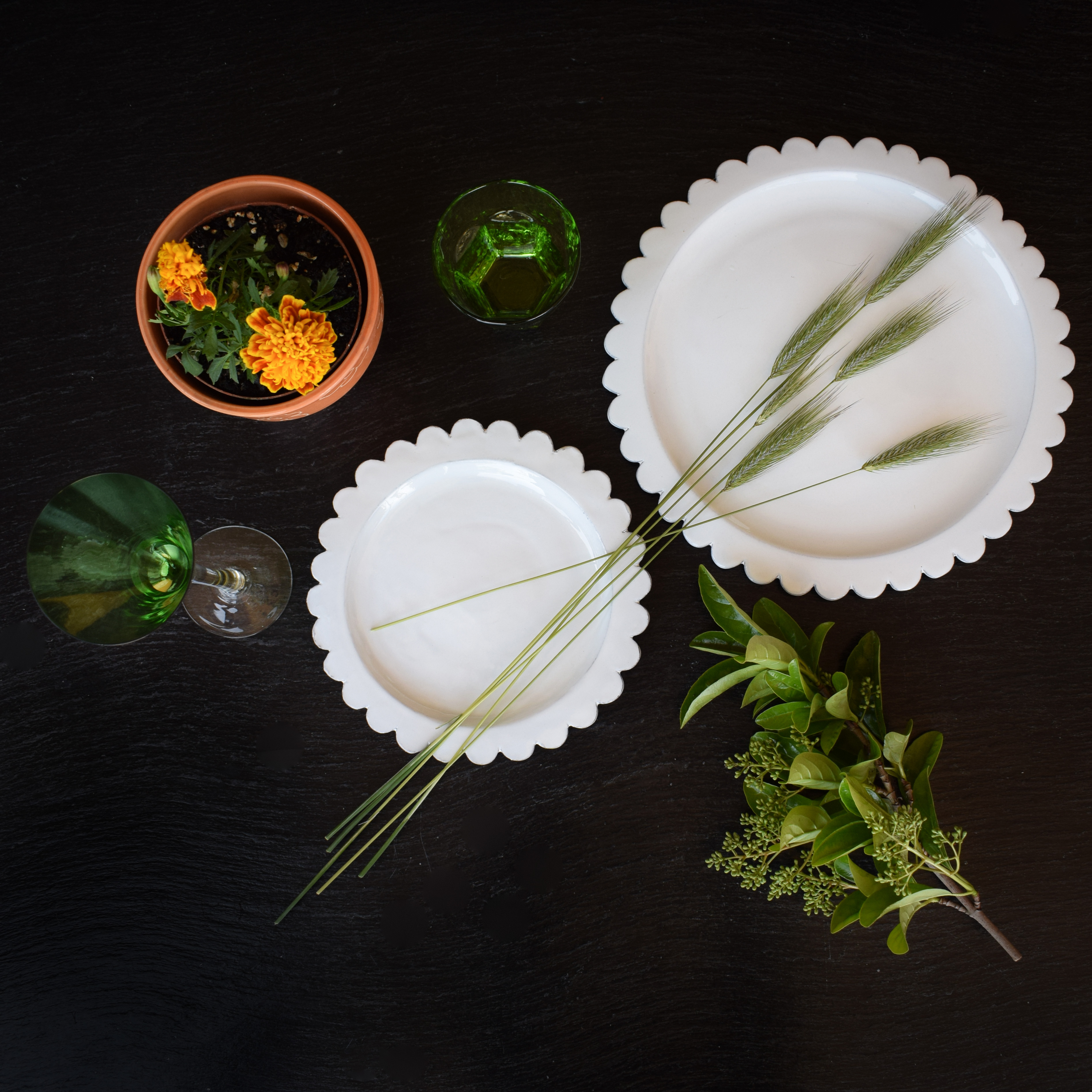

This table setting starring our Corolla collection is mainly focused on the Chive tone, which is the herbal green tone of the plants and the glasses. This color gives a sense of healthiness and regeneration to your table setting. In addition, the Saffron yellow shade gives an interesting sparkle to the whole set.
4. Grape Compote
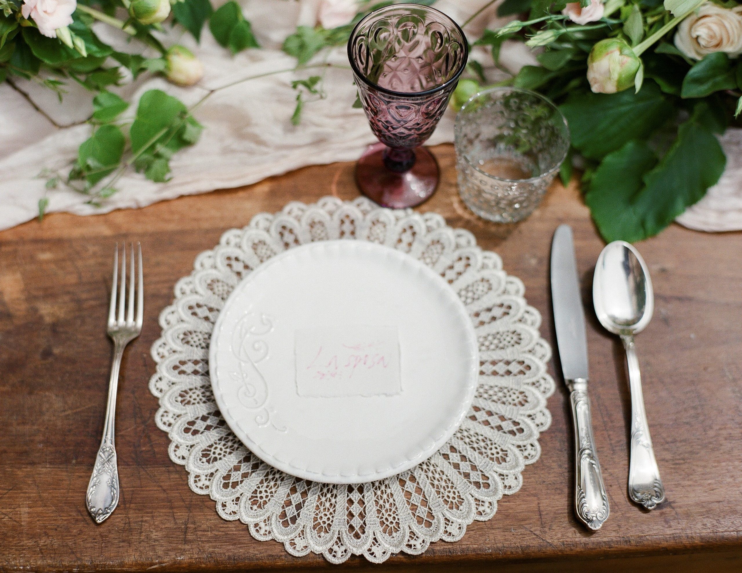
In this fourth table setting we move away from the Navy Blazer background to embrace a wooden surface (Cinnamon Stick Pantone shade). On one side we have the whiteness and delicacy of the Ricamo plate, the transparent glass and the tablecloth. On the other, we have the stronger tones of the wooden surface, of the Chive leaves and of the Grape Compote glass. However, all these shades seem to create a very delicate and light combination. This is also because of the specific kinds decorations, shapes and tableware used in the table setting: from the glasses, to the cloth beneath the plate and the Sunlight roses.
5. Faded Denim
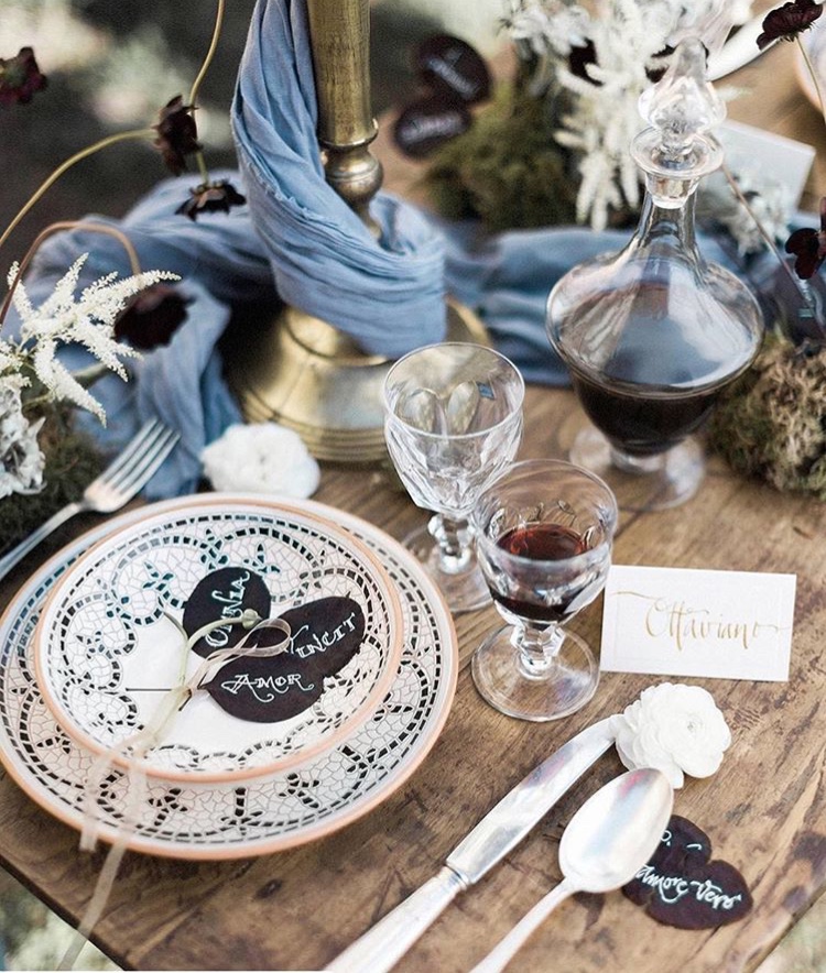
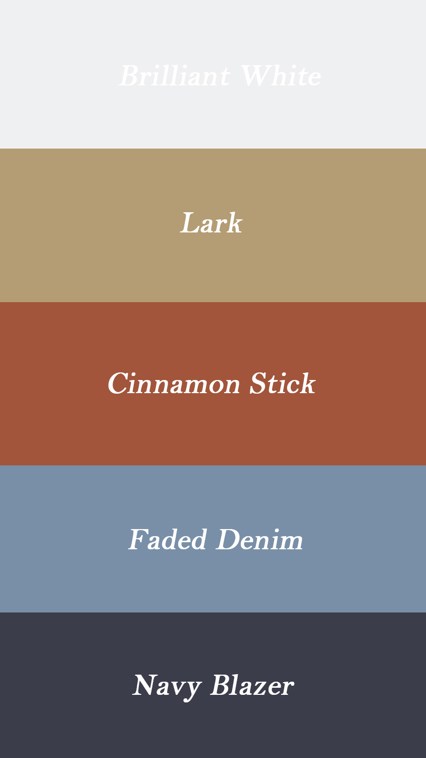
This cute table-styling blends together the rustic Lark and Cinnamon Stick tones of the table and the wine, with a light blue cloth that wraps around the centerpiece. The Faded Denim shade really stands out among the darker shades of the wine, the black flowers, the notes and the geometric mosaic of our Mosaic collection. This fresh look is perfect for both Spring and Summer outdoor lunches and dinners.
❤❤❤
If you want to know more about the characteristics of each color of the Pantone 2020 color palette, check out the stories of our Instagram account @dishesonly ❣️
Try to use the Pantone colors to style your table at home and let us know the results in the comments below!